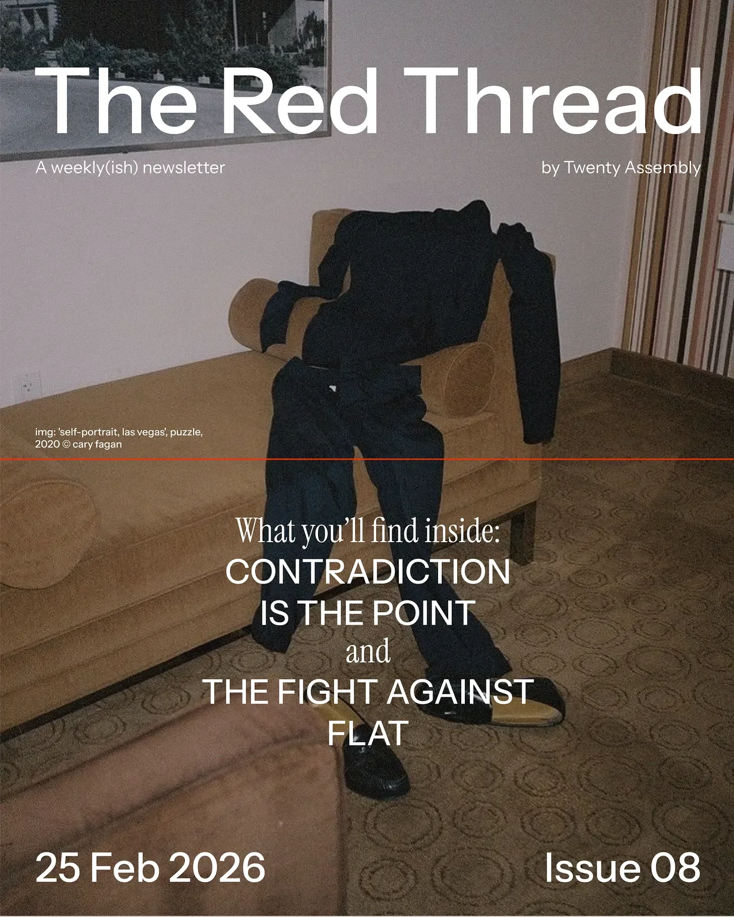
ISSUE 08: Contradiction is the point
Welcome to The Red Thread, a weekly(-ish) branding and culture newsletter exploring what founder-led brands can learn from cult luxury heavyweights in order to build the same kind of timeless, relevant, culturally aware, and irreplaceable positioning in their own categories.
If you find this useful and would like The Red Thread directly to your inbox, then subscribe for free below
The most magnetic brands are purposefully contradictory.
I’ve been thinking about this for a while now, and I keep coming back to the same conclusion: every brand I’ve ever been genuinely obsessed with holds a deliberate this vs. that at its core. And it’s not in a scattered, ‘we haven’t worked out our positioning’ way. It’s in an intentional, ‘the contradiction is the positioning’ way.
Contradiction is the point.
It’s not about confusion or a lack of clarity. I’m talking about a deliberate, strategic tension between two opposing ideas that should cancel each other out but instead create something electric.
I guarantee you’ve felt this. You’ve stood in a space or scrolled past a brand and thought I can’t explain why this works, but it does. That pull? That slight cognitive friction that makes you lean in rather than scroll on by? That’s tension doing its job.
So why do some brands feel alive while others feel like they were assembled by a committee using a Canva template and a mission statement that no one read twice?
What exactly is tension branding?
Let’s be specific, because this isn’t just a “vibes” thing.
Tension branding is holding two opposing ideas in balance without collapsing into one. There’s no dilution or compromise. They just coexist.
Think about cultural dualities for a second. We’re drawn to people who are soft and strong. To places that feel ancient and modern. To ideas that are simple on the surface and complex underneath. That’s because our brains are wired to find contrast interesting.
In design (where I’ve spent much of my career), tension is foundational to a design’s success. Light vs dark, hard vs. soft, minimal vs expressive, order against chaos. You need both forces pushing against each other to create visual energy. Without this contrast, everything goes flat. Dead. It feels like a room with no windows.
Same in branding. Same in people, honestly. The most compelling person at any dinner party is the one who’s never entirely one thing.
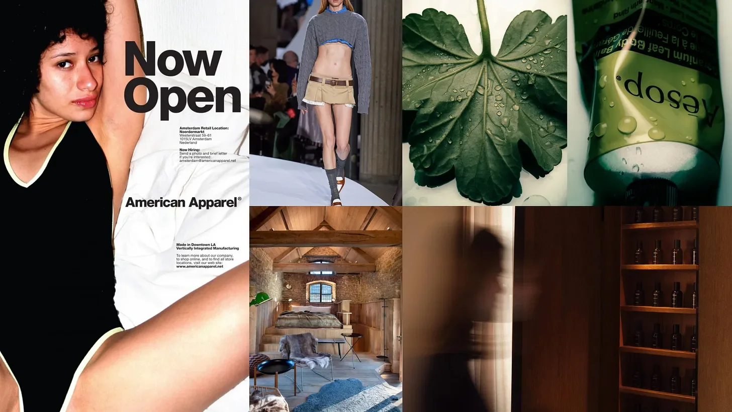
American Apparel, Miu Miu, The Newt in Somerset, Aesop
Brands that hold opposites
Here’s just a few examples of where we’ve seen tension branding done well:
Miu Miu — The Miu Miu woman wraps her bookish and slightly subversive intellect with polished luxury. The brand balances a youthful, almost naïve spirit with intellectually complex, slightly provocative design. It’s the granny knits styled with micro-minis and high socks. The girl sporting a scallop trim collar (buttoned to the top) with nylon hot pants reading Aleramo’s Una Donna. It looks like it shouldn't be taken seriously, and that's precisely why it commands the room. Neither side explains the brand alone, and if you tried to resolve the contradiction, you'd kill the thing that makes it magnetic.
The Newt in Somerset — Here we’ve got rugged countryside against refined elegance. English landscape, agricultural honesty, muddy boots energy. And then immaculate hospitality, aesthetic precision, next-level attention to detail. Local ingredients from land to livestock served with Three Michelin Keys. Neither side wins out or diminishes the other, they just coexist. That’s the draw. Londonders don’t need to leave the city in search of luxury, but they travel for the contradiction.
American Apparel — A controversial throwback to the indie sleaze American Apparel of the 00s, but one that worked. The tension was sex against idealism. Often uncomfortably provocative imagery of girls alongside an openly ethical manufacturing narrative. It mirrored a generation’s internal contradiction: wanting to be desired and wanting to be good. There’s plenty to argue about whether the brand itself lived up to its ethics, and we’d be right to, but the tension in the brand was genuinely ahead of its time. And it worked.
Aesop — Clinical intelligence against poetic sensuality. Apothecary minimalism and lyrical visual language. Science and philosophy in the same breath. The packaging says laboratory. The copy says literature. And somehow neither feels like it's performing. In a beauty market drowning in either clinical claims or emotional fluff, Aesop holds both without flinching.
Japan — Okay I know Japan isn't technically a brand (and I can already see all of the ‘goes to Japan once’ memes my friends are about to send me), but stay with me. It’s hyper-futurism against deep tradition. Bullet trains and tea ceremonies. Robot hotels and 400 year old ryokans. A nation built on both past and future that don’t compete but instead somehow inform each other. The Japanese have been doing tension branding for centuries.
Why this matters right now
We are living through a moment of profound identity complexity. Audiences aren’t monolithic (were they ever, really?). People are layered and contradictory. Your customer is not one thing, and she knows it.
She buys 10-step skincare routines yet often can’t be bothered to take her makeup off before bed (my pores are shrieking in horror at the thought).
She wants both discipline and shortcuts. Aspiration and indifference. Consumerism and a clean conscience. She reads about dopamine detoxes and buys an analogue bag and then spends three hours on TikTok.
She’s human.
And yet so many brands still operate as if their audience is a single archetype with a single desire and a single emotional register. If your brand chooses only one side, you will lose her. It won’t be because she disagrees with you, but because she can’t find herself in you.
The fight against flat
I think the distinction that matters most here is between brands that feel dimensional and brands that feel flat.
A flat brand has a single note. A single promise delivered the same way every time. It’s consistent, sure (I already wrote all about how you’re probably getting brand consistency wrong). But it’s also hella boring. It’s the brand equivalent of someone who only talks about one thing at every party – reliable on paper yet emotionally forgettable. Also likely to not be invited to the next party.
A dimensional brand contains friction. It has an edge and feels alive. It can hold two truths at once without having an existential crisis about it. It doesn’t smooth every contradiction into a tidy resolution because it understands that the unresolved space is where the energy lives.
So the question I’d put to anyone working on a brand right now: is yours too resolved? Too perfect? Have you sanded off every rough edge in pursuit of “brand clarity” and ended up with something no one can feel?
How to find your brand’s core tension
This is where I want to be useful rather than just opinionated (though I reserve the right to be both).
Start with three questions:
What two opposing desires live inside your customer? Not what they say in a focus group (value/action gaps are very real) what they actually feel. The contradictions they navigate daily.
What tension defines your category? Every industry has one. Luxury vs. accessibility. Innovation vs. trust. Speed vs. quality. Where is the live wire in your space?
What are you afraid to say because it “confuses” the positioning? This one’s my favourite, because the thing you’re nervous about is usually the thing that would make your brand interesting. The instinct to resolve every contradiction is strong, but resolution isn’t always the goal. Sometimes the tension IS the strategy.
And here’s the litmus test: your tension should feel slightly uncomfortable. Like it doesn’t quite fit together neatly. That’s usually the signal you’re onto something.
tension in visual design
A note on how this shows up in design
I can’t write about tension without bringing it back to the visual, because this is where we often see evidence of it playing out every day.
In visual systems, tension shows up as contrast that shouldn’t work but does. A classical serif typeface on a brutalist grid. Soft, intimate photography paired with sharp, almost aggressive typography. A muted, restrained palette interrupted by a disruptive headline.
Innovation happens in the contrast between elements, not in the elements themselves. A beautiful typeface on its own is just a typeface. Put it in conversation with something that challenges it, and suddenly both become more interesting.
Visual harmony without tension is flat, but tension without harmony can be chaotic. A good creative knows how to hold both. When to push and when to pull back. Which contradiction serves the story and which one just creates noise.
That’s not something a mood board can teach you. It’s not even something AI can create for you (yet). It comes from looking at a lot of work, making a lot of work, and developing an instinct for when something has enough friction to feel alive.
How cults are born
The brands we obsess over don’t try to resolve our contradictions. Instead, they reflect them back to us. And in doing so, they somehow give us permission to be complex. To want incompatible things: to be disciplined and chaotic, aspirational and grounded, polished and unfussed. It’s how we recognise ourselves in brands and how cult followings are born.
So stop worrying about how to make your brand make sense in a single sentence and instead start asking what two truths it can hold at once.
The tension isn’t the problem. It’s the whole point.
Until next week,
Hilary x