
BRAND STRATEGY, VISUAL IDENTITY, ART DIRECTION
Photography by Josh Shinner
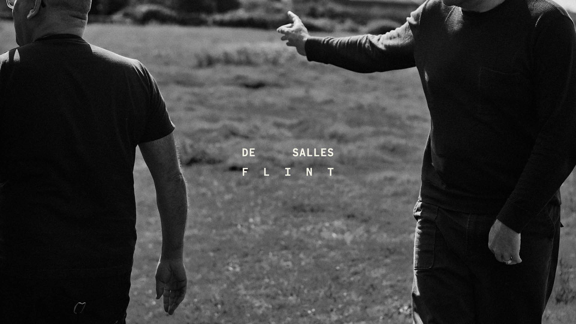
Synergy in collaboration.
After 10 years of running a successful interior design agency, DeSalles Flint wanted to reposition their brand to attract more luxury hospitality and residential clients.
The challenge? Communicating their boutique, hands-on, highly personal service without losing credibility at a larger, more premium scale.
How do you feel personal and premium?
The Brief:
We kicked things off with a facilitated strategy workshop with the two founders, reviewing the market, competitors, and how luxury studios typically present themselves.
What stood out quickly? Most competitors felt cold, corporate, hierarchical, and emotionally distant.
Clients in the luxury space weren’t just buying outcomes. They were buying relationships.
The Research:
The brief shifted from “look more premium” to something more powerful: Position DeSalles Flint as a true creative partner, not a service provider.
This was about collaboration, intimacy, and shared ownership of the outcome.
The Brief, Redefined:
The new target audience consisted of luxury hospitality and residential clients who value process as much as results.
They want to feel involved, understood, and creatively energised, rather than managed from
a distance.
The Audience:
Despite their experience and talent, DeSalles Flint’s existing brand didn’t reflect how they actually worked.
Their collaborative, human approach wasn’t visible and this made it harder to attract larger luxury clients who expect clarity, confidence, and emotional connection from the outset.
The Problem:
The most compelling work happens when collaboration is treated as a creative force.
Inspired by the natural phenomenon of starling murmurations. Movement, rhythm, and responsiveness create something greater than the individual. We found the perfect metaphor for how DeSalles Flint works.
The Insight:


The brand was repositioned around a central idea: Synergy Through Collaboration.
This communicated that working with DeSalles Flint creates outcomes richer and more considered than any single perspective alone.
From there, we refreshed the brand’s purpose, values, and long-term vision, reflecting how the studio had evolved over a decade of practice.
We then defined the brand as a person, clarifying tone of voice, personality traits, and key language cues. These led directly into a new visual identity system.
The resulting identity draws on the energy and rhythm of murmurations. This is expressed through adaptable layouts, shifting spacing, and a dynamic sense of movement. Muted, nature-derived tones reinforce the founders’ grounded, hands-on approach, while a bold blood-orange accent introduces surprise and quiet confidence.
I delivered a complete brand system including strategy, visual identity, tone of voice, copywriting, art direction, and application. Developing a platform built for both growth and depth.
Photography by Josh Shinner.
The Positioning:
The most compelling work happens when collaboration is treated as a creative force.
Inspired by the natural phenomenon of starling murmurations. Movement, rhythm, and responsiveness create something greater than the individual. We found the perfect metaphor for how DeSalles Flint works.


