VISUAL IDENTITY, ART DIRECTION
Photography by Josh Shinner
For those who already understand
Cape God is a contemporary luxury brand dedicated to a single, often misunderstood and overlooked garment: the cape. The business began with an understanding, not an idea. The ensuing work was about distilling that understanding into a brand that knows exactly who it’s for and is entirely comfortable being overlooked by who it is not. The brief called for restraint, confidence, and a point of view. My role was to give shape to something that already quietly existed and make it unmistakable to the people who would recognise it immediately.
The strategic foundations were set by resisting fashion’s usual impulses. No trend-chasing or distractions from seasonal noise. Instead, we positioned Cape God as a specialist. Dedicated to capes, not as seasonal whims, but as essential expressions of understated sophistication.
I established a world that values cultural intelligence, longevity over trends, and elegance that doesn’t ask for attention. This strategy became the filter for every creative decision that followed.

From there, we defined a woman guided by sensibility rather than status. Someone culturally fluent, creatively curious, and long past needing validation. The brand voice, visual language, and experience were all designed to speak to her, not explain themselves to everyone else.
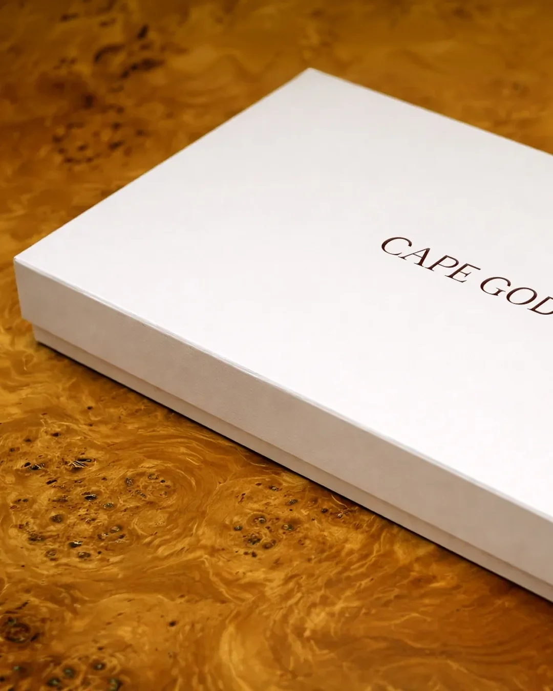
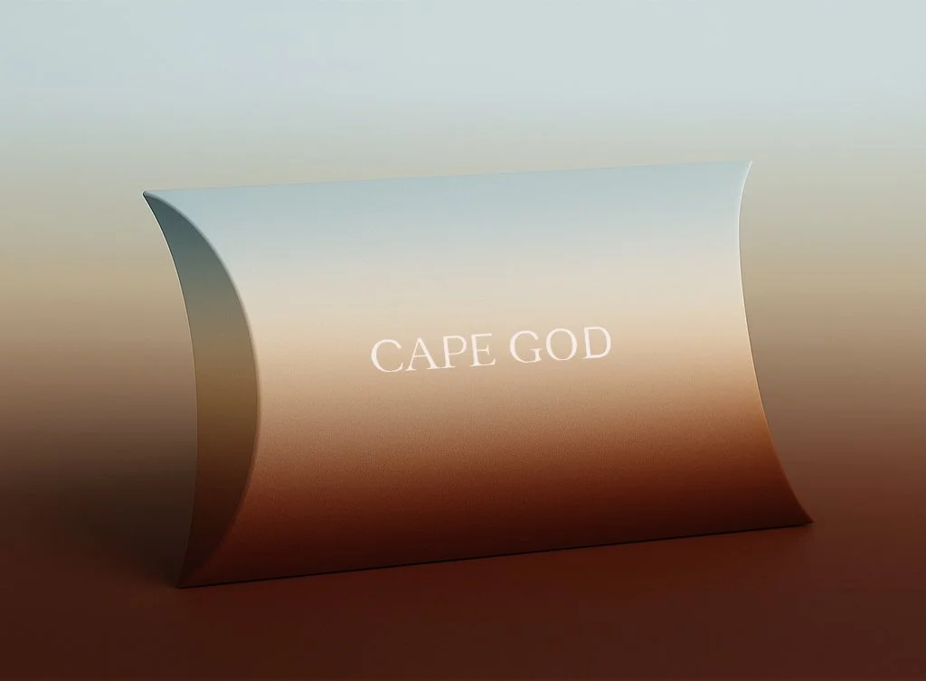
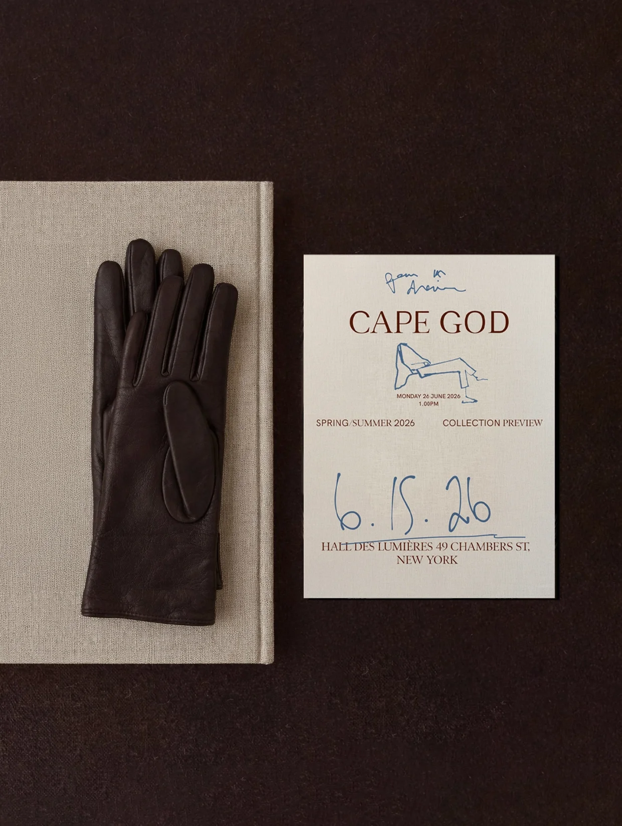
The identity system reflects that philosophy, underscored by transformation and subtle eccentricity. The logomark shifts from sans serif to serif, echoing the way a cape transforms the everyday into something elevated. Typography that balances clarity with intellect, and a warm, grown-up palette that avoids the obvious signals of luxury.
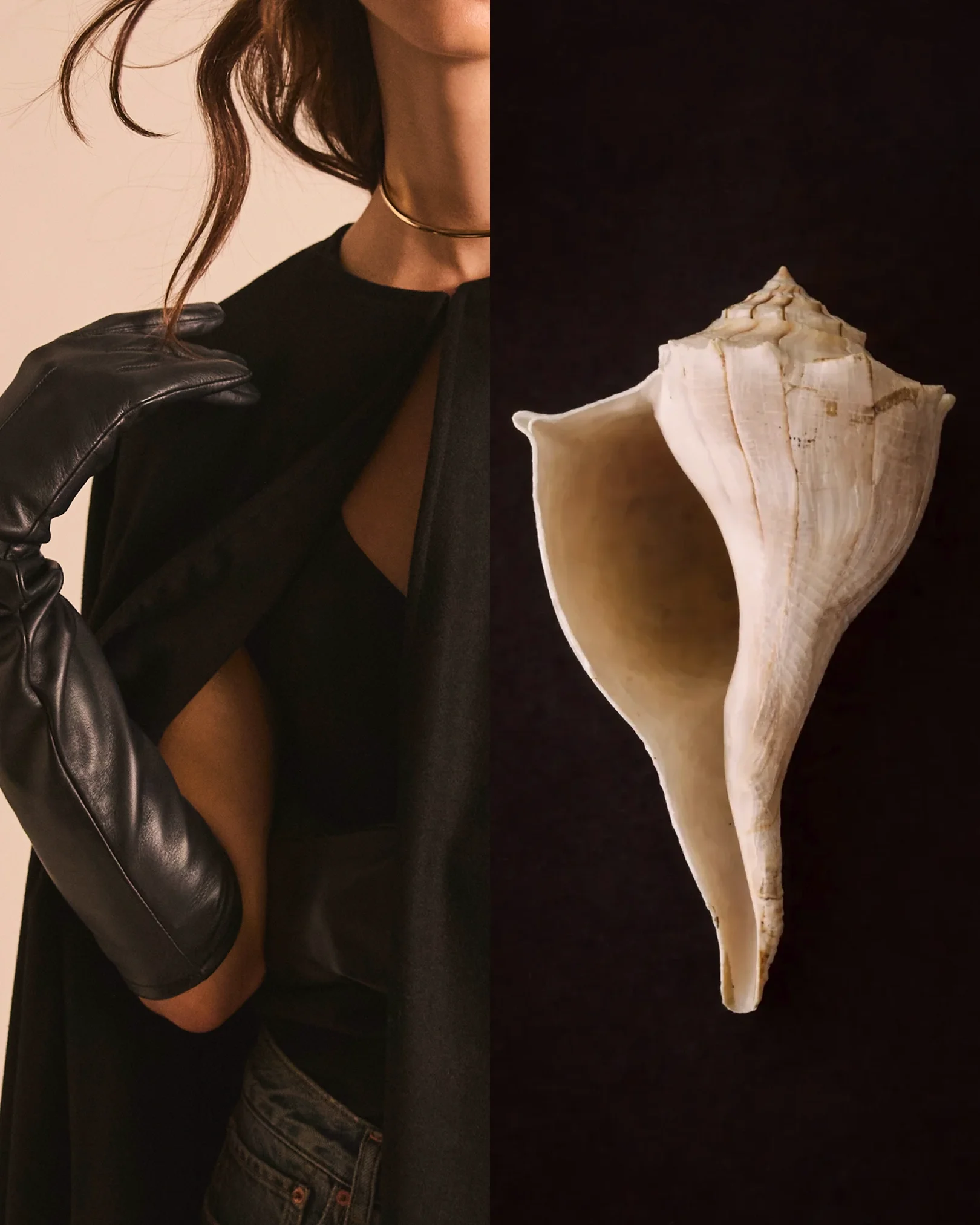
Imagery leans into juxtaposition and obscurity, often using elevated everyday objects to suggest transformation, and allowing mystery to do the heavy lifting. Handwritten graphic elements reference artists’ studies, lifting the curtain on process and craftsmanship.
The result is a cohesive brand system that feels discovered, not announced. One that positions Cape God as an authority in its category, recognised instantly by those who understand it, and invisible to those who don’t.